
- Cool Plots
Here we spend some time to look at plots which are not like the traditional plots that we have seen before. Below are different ways to use graphics to explore data and describe trends to show patterns.
But first, let’s get into a Jupyter client where we can run Python code.
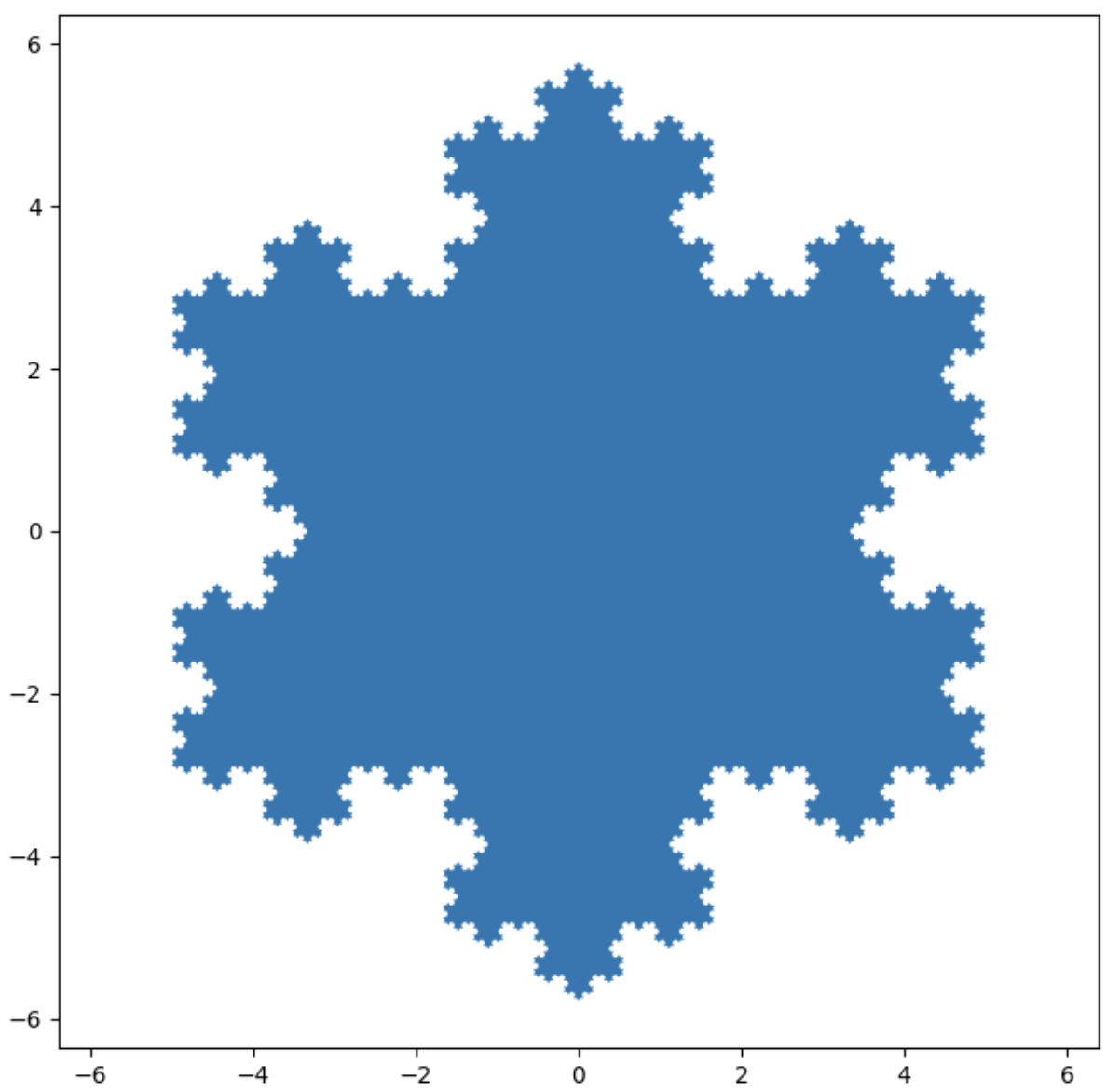
The Koch Snowflake (a fractle)
import matplotlib.pyplot as plt
import numpy as np


def koch_snowflake(order, scale=10):
    """
    Return two lists x, y of point
    coordinates of the Koch snowflake.

    Parameters
    ----------
    order : int
        The recursion depth.
    scale : float
        The extent of the snowflake
        (edge length of the base triangle).
    """
    def _koch_snowflake_complex(order):
        if order == 0:
            # initial triangle
            angles = np.array([0, 120, 240]) + 90
            return scale / np.sqrt(3) *
             np.exp(np.deg2rad(angles) * 1j)
        else:
            ZR = 0.5 - 0.5j * np.sqrt(3) / 3

             # start points
            p1 = _koch_snowflake_complex(order - 1)
            p2 = np.roll(p1, shift=-1)  # end points
            dp = p2 - p1  # connection vectors

            new_points = np.empty(len(p1) * 4, dtype=np.complex128)
            new_points[::4] = p1
            new_points[1::4] = p1 + dp / 3
            new_points[2::4] = p1 + dp * ZR
            new_points[3::4] = p1 + dp / 3 * 2
            return new_points

    points = _koch_snowflake_complex(order)
    x, y = points.real, points.imag
    return x, y

x, y = koch_snowflake(order=5)

plt.figure(figsize=(8, 8))
plt.axis('equal')
plt.fill(x, y)
plt.show()
Love this kind of plot? Then check out more like it at MatPlotLib for filled polygon analysis.
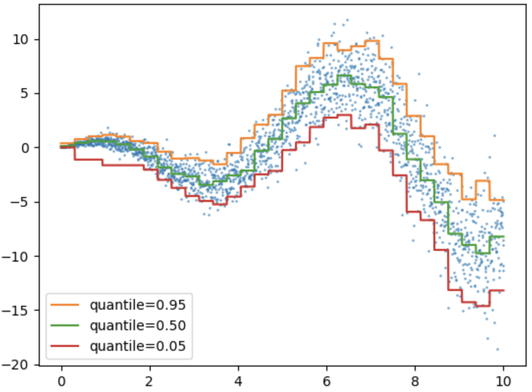
Quantile Loss
Try to run the code below to see what kind of plot it makes. What can you see in this plot? What can you not see in this plot? In other words, what kinds of information is provided in this plot?
from sklearn.ensemble import HistGradientBoostingRegressor
import numpy as np
import matplotlib.pyplot as plt

# Simple regression function for X * cos(X)
rng = np.random.RandomState(42)
X_1d = np.linspace(0, 10, num=2000)
X = X_1d.reshape(-1, 1)
y = X_1d * np.cos(X_1d) + rng.normal(scale=X_1d / 3)

quantiles = [0.95, 0.5, 0.05]
parameters = dict(loss="quantile", max_bins=32, max_iter=50)
hist_quantiles = {
    f"quantile={quantile:.2f}": HistGradientBoostingRegressor(
        **parameters, quantile=quantile
    ).fit(X, y)
    for quantile in quantiles
}

fig, ax = plt.subplots()
ax.plot(X_1d, y, "o", alpha=0.5, markersize=1)
for quantile, hist in hist_quantiles.items():
    ax.plot(X_1d, hist.predict(X), label=quantile)
_ = ax.legend(loc="lower left")

plt.show()
Love this kind of plot? Then check out more like it at SciKit for quantile analysis.
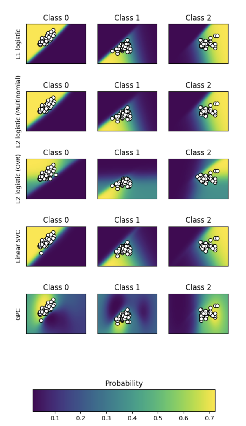
Plot Classification Probability
What does this plot show? Why are there so many subplots? What does a comparison lead you to think?
# Author: Alexandre Gramfort <alexandre.gramfort@inria.fr>
# License: BSD 3 clause

import matplotlib.pyplot as plt
import numpy as np

from sklearn import datasets
from sklearn.gaussian_process import GaussianProcessClassifier
from sklearn.gaussian_process.kernels import RBF
from sklearn.linear_model import LogisticRegression
from sklearn.metrics import accuracy_score
from sklearn.svm import SVC

iris = datasets.load_iris()

# we only take the first two features for visualization
X = iris.data[:, 0:2]
y = iris.target

n_features = X.shape[1]

C = 10
kernel = 1.0 * RBF([1.0, 1.0])  # for GPC

# Create different classifiers.
classifiers = {
    "L1 logistic": LogisticRegression(
        C=C, penalty="l1", solver="saga", multi_class="multinomial", max_iter=10000
    ),
    "L2 logistic (Multinomial)": LogisticRegression(
        C=C, penalty="l2", solver="saga", multi_class="multinomial", max_iter=10000
    ),
    "L2 logistic (OvR)": LogisticRegression(
        C=C, penalty="l2", solver="saga", multi_class="ovr", max_iter=10000
    ),
    "Linear SVC": SVC(kernel="linear", C=C, probability=True, random_state=0),
    "GPC": GaussianProcessClassifier(kernel),
}

n_classifiers = len(classifiers)

plt.figure(figsize=(3 * 2, n_classifiers * 2))
plt.subplots_adjust(bottom=0.2, top=0.95)

xx = np.linspace(3, 9, 100)
yy = np.linspace(1, 5, 100).T
xx, yy = np.meshgrid(xx, yy)
Xfull = np.c_[xx.ravel(), yy.ravel()]

for index, (name, classifier) in enumerate(classifiers.items()):
    classifier.fit(X, y)

    y_pred = classifier.predict(X)
    accuracy = accuracy_score(y, y_pred)
    print("Accuracy (train) for %s: %0.1f%% " % (name, accuracy * 100))

    # View probabilities:
    probas = classifier.predict_proba(Xfull)
    n_classes = np.unique(y_pred).size
    for k in range(n_classes):
        plt.subplot(n_classifiers, n_classes, index * n_classes + k + 1)
        plt.title("Class %d" % k)
        if k == 0:
            plt.ylabel(name)
        imshow_handle = plt.imshow(
            probas[:, k].reshape((100, 100)), extent=(3, 9, 1, 5), origin="lower"
        )
        plt.xticks(())
        plt.yticks(())
        idx = y_pred == k
        if idx.any():
            plt.scatter(X[idx, 0], X[idx, 1], marker="o", c="w", edgecolor="k")

ax = plt.axes([0.15, 0.04, 0.7, 0.05])
plt.title("Probability")
plt.colorbar(imshow_handle, cax=ax, orientation="horizontal")

plt.show()
Love this kind of plot? Then check out more like it at SciKit for Plot classification probability analysis.
Clustering: A demo of structured Ward hierarchical clustering on an image of coins
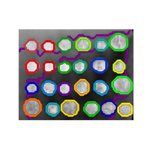
### Generate data
from skimage.data import coins

orig_coins = coins()

import numpy as np
from scipy.ndimage import gaussian_filter
from skimage.transform import rescale

smoothened_coins = gaussian_filter(orig_coins, sigma=2)
rescaled_coins = rescale(
    smoothened_coins,
    0.2,
    mode="reflect",
    anti_aliasing=False,
)
X = np.reshape(rescaled_coins, (-1, 1))

# Define structure of the data
from sklearn.feature_extraction.image import grid_to_graph
connectivity = grid_to_graph(*rescaled_coins.shape)

# Compute clustering
import time as time
from sklearn.cluster import AgglomerativeClustering

print("Compute structured hierarchical clustering...")
st = time.time()
n_clusters = 27  # number of regions
ward = AgglomerativeClustering(
    n_clusters=n_clusters, linkage="ward", connectivity=connectivity
)
ward.fit(X)
label = np.reshape(ward.labels_, rescaled_coins.shape)
print(f"Elapsed time: {time.time() - st:.3f}s")
print(f"Number of pixels: {label.size}")
print(f"Number of clusters: {np.unique(label).size}")

# plotting
import matplotlib.pyplot as plt
plt.figure(figsize=(5, 5))
plt.imshow(rescaled_coins, cmap=plt.cm.gray)
for l in range(n_clusters):
    plt.contour(
        label == l,
        colors=[
            plt.cm.nipy_spectral(l / float(n_clusters)),
        ],
    )
plt.axis("off")
plt.show()
Scatter

import matplotlib.pyplot as plt
import numpy as np

# Fixing random state for reproducibility
np.random.seed(19680801)

N = 100
r0 = 0.6
x = 0.9 * np.random.rand(N)
y = 0.9 * np.random.rand(N)
area = (20 * np.random.rand(N))**2  # 0 to 10 point radii
c = np.sqrt(area)
r = np.sqrt(x ** 2 + y ** 2)
area1 = np.ma.masked_where(r < r0, area)
area2 = np.ma.masked_where(r >= r0, area)
plt.scatter(x, y, s=area1, marker='^', c=c)
plt.scatter(x, y, s=area2, marker='o', c=c)
# Show the boundary between the regions:
theta = np.arange(0, np.pi / 2, 0.01)
plt.plot(r0 * np.cos(theta), r0 * np.sin(theta))
plt.show()
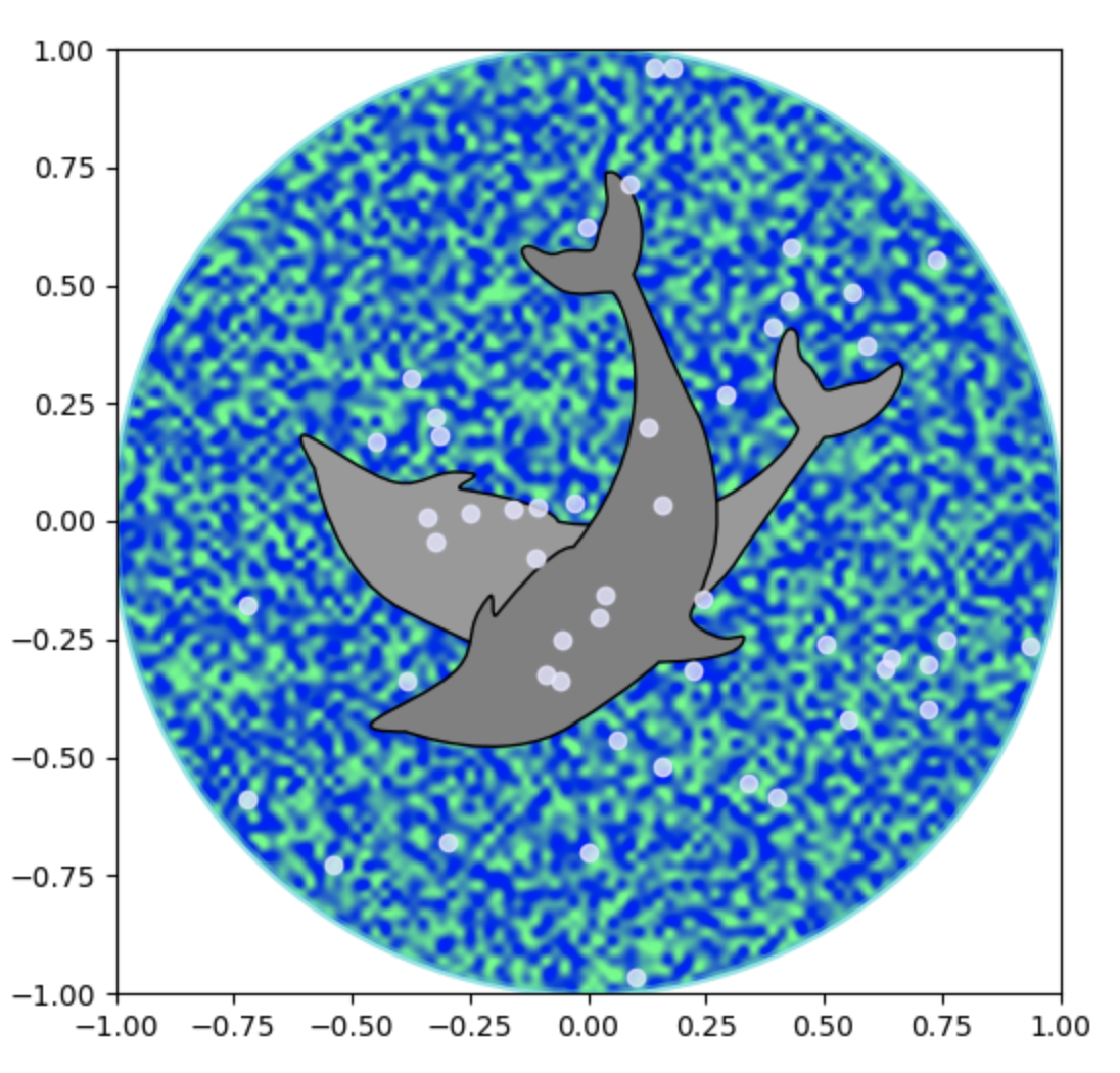
Dolphin plot
import matplotlib.cm as cm
import matplotlib.pyplot as plt
from matplotlib.patches import Circle, PathPatch
from matplotlib.path import Path
from matplotlib.transforms import Affine2D
import numpy as np

# Fixing random state for reproducibility
np.random.seed(19680801)


r = np.random.rand(50)
t = np.random.rand(50) * np.pi * 2.0
x = r * np.cos(t)
y = r * np.sin(t)

fig, ax = plt.subplots(figsize=(6, 6))
circle = Circle((0, 0), 1, facecolor='none',
                edgecolor=(0, 0.8, 0.8), linewidth=3, alpha=0.5)
ax.add_patch(circle)

im = plt.imshow(np.random.random((100, 100)),
                origin='lower', cmap=cm.winter,
                interpolation='spline36',
                extent=([-1, 1, -1, 1]))
im.set_clip_path(circle)

plt.plot(x, y, 'o', color=(0.9, 0.9, 1.0), alpha=0.8)

# Dolphin from OpenClipart library by Andy Fitzsimon
#   <cc:License rdf:about="http://web.resource.org/cc/PublicDomain">
#     <cc:permits rdf:resource="http://web.resource.org/cc/Reproduction"/>
#     <cc:permits rdf:resource="http://web.resource.org/cc/Distribution"/>
#     <cc:permits rdf:resource="http://web.resource.org/cc/DerivativeWorks"/>
#   </cc:License>

# Data to draw the dolphin shapes.
dolphin = """
M -0.59739425,160.18173 C -0.62740401,160.18885 -0.57867129,160.11183
-0.57867129,160.11183 C -0.57867129,160.11183 -0.5438361,159.89315
-0.39514638,159.81496 C -0.24645668,159.73678 -0.18316813,159.71981
-0.18316813,159.71981 C -0.18316813,159.71981 -0.10322971,159.58124
-0.057804323,159.58725 C -0.029723983,159.58913 -0.061841603,159.60356
-0.071265813,159.62815 C -0.080250183,159.65325 -0.082918513,159.70554
-0.061841203,159.71248 C -0.040763903,159.7194 -0.0066711426,159.71091
0.077336307,159.73612 C 0.16879567,159.76377 0.28380306,159.86448
0.31516668,159.91533 C 0.3465303,159.96618 0.5011127,160.1771
0.5011127,160.1771 C 0.63668998,160.19238 0.67763022,160.31259
0.66556395,160.32668 C 0.65339985,160.34212 0.66350443,160.33642
0.64907098,160.33088 C 0.63463742,160.32533 0.61309688,160.297
0.5789627,160.29339 C 0.54348657,160.28968 0.52329693,160.27674
0.50728856,160.27737 C 0.49060916,160.27795 0.48965803,160.31565
0.46114204,160.33673 C 0.43329696,160.35786 0.4570711,160.39871
0.43309565,160.40685 C 0.4105108,160.41442 0.39416631,160.33027
0.3954995,160.2935 C 0.39683269,160.25672 0.43807996,160.21522
0.44567915,160.19734 C 0.45327833,160.17946 0.27946869,159.9424
-0.061852613,159.99845 C -0.083965233,160.0427 -0.26176109,160.06683
-0.26176109,160.06683 C -0.30127962,160.07028 -0.21167141,160.09731
-0.24649368,160.1011 C -0.32642366,160.11569 -0.34521187,160.06895
-0.40622293,160.0819 C -0.467234,160.09485 -0.56738444,160.17461
-0.59739425,160.18173
"""

vertices = []
codes = []
parts = dolphin.split()
i = 0
code_map = {
    'M': Path.MOVETO,
    'C': Path.CURVE4,
    'L': Path.LINETO,
}

while i < len(parts):
    path_code = code_map[parts[i]]
    npoints = Path.NUM_VERTICES_FOR_CODE[path_code]
    codes.extend([path_code] * npoints)
    vertices.extend([[*map(float, y.split(','))]
                     for y in parts[i + 1:][:npoints]])
    i += npoints + 1
vertices = np.array(vertices)
vertices[:, 1] -= 160

dolphin_path = Path(vertices, codes)
dolphin_patch = PathPatch(dolphin_path,
                        facecolor=(0.6, 0.6, 0.6),
                        edgecolor=(0.0, 0.0, 0.0))
ax.add_patch(dolphin_patch)

vertices = Affine2D().rotate_deg(60).transform(vertices)
dolphin_path2 = Path(vertices, codes)
dolphin_patch2 = PathPatch(dolphin_path2,
                        facecolor=(0.5, 0.5, 0.5),
                        edgecolor=(0.0, 0.0, 0.0))
ax.add_patch(dolphin_patch2)

plt.show()
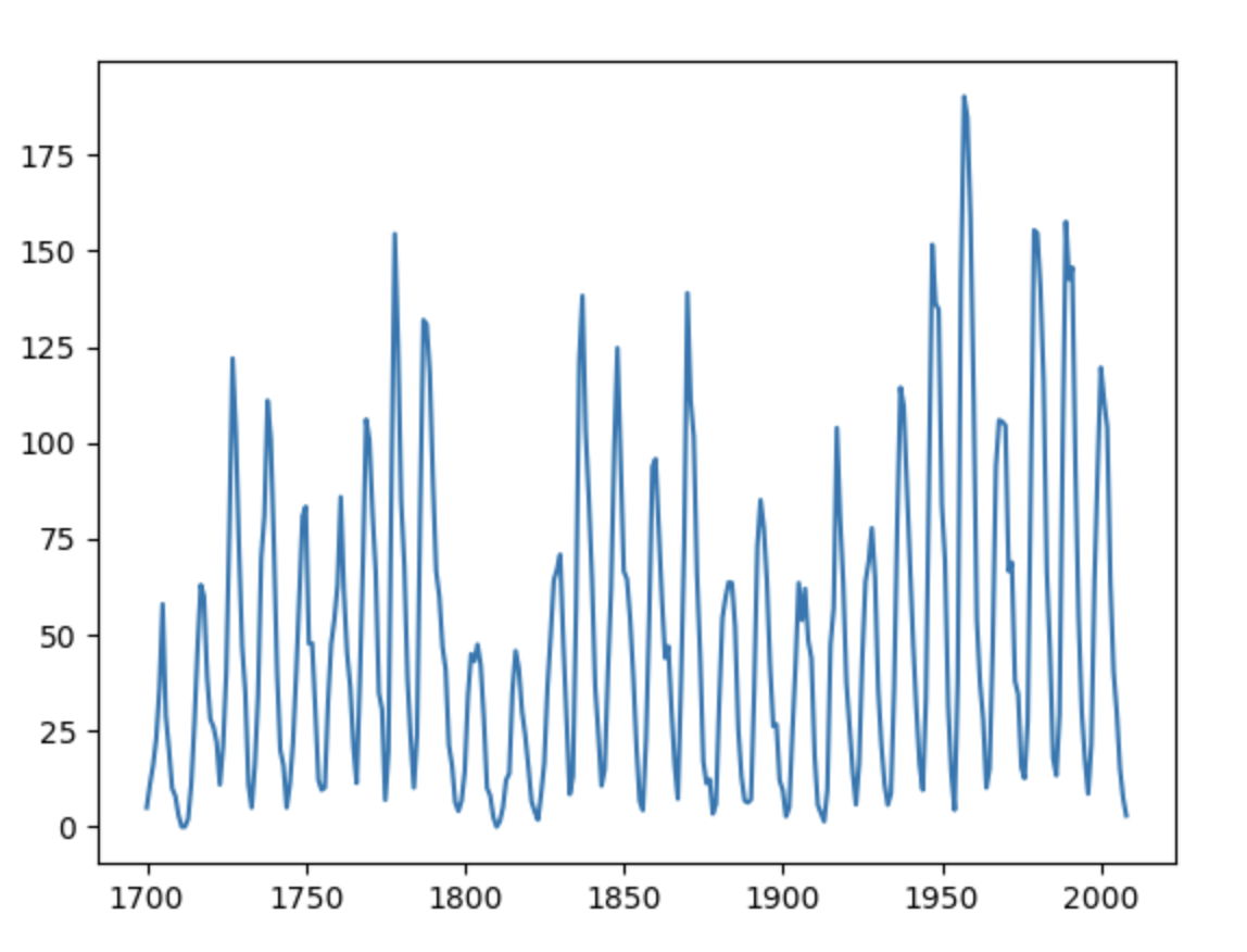
SunSpots!
import statsmodels.api as sm
import pandas as pd
import matplotlib.pyplot as plt

data_loader = sm.datasets.sunspots.load_pandas()
df = data_loader.data

df
df.head()
df.tail()
#Take the modulo of each value with 1
#to get the fractional part
fractional_nums = df['SUNACTIVITY'].apply(lambda x: x % 1)
fractional_nums[fractional_nums > 0].head()
print(df['SUNACTIVITY'].describe())

plt.xlabel('Year')
plt.ylabel('Sun Activity')

myX = list(df["YEAR"])
myY = list(df["SUNACTIVITY"])

plt.plot(myX, myY)
plt.show()
Check out more plotting and Python code at the following URLs. Note, you may have to copy and paste code into your browser’s Jupyter notebook.