
- T Tests
🔬 T-Tests: Being a Data Detective!
Welcome to the world of statistical hypothesis testing - where we use math to answer questions like a detective solves mysteries! 🕵️
The Big Question: Are These Groups Really Different?
Imagine you’re testing two different energy drinks 🥤 to see which one actually helps people stay awake longer. You give 50 people Drink A and 50 people Drink B, then measure how many hours they stay alert.
The question: Do the drinks REALLY make a difference, or are we just seeing random variation?
This is where t-tests come in! They help us answer: “Is the difference we’re seeing real, or just luck?”
Real-World Examples 🌍
T-tests are used everywhere:
- Medicine: Does a new drug actually work better than the old one?
- Education: Do students learn better with Method A or Method B?
- Gaming: Does Practice Routine X improve player performance more than Routine Y?
- Manufacturing: Are bottles from Machine 1 filled differently than Machine 2?
- Sports: Do athletes run faster with Brand X shoes vs Brand Y shoes?
Let’s Dive In! 🏊
First, let’s get into a Jupyter client where we can run Python code and explore!
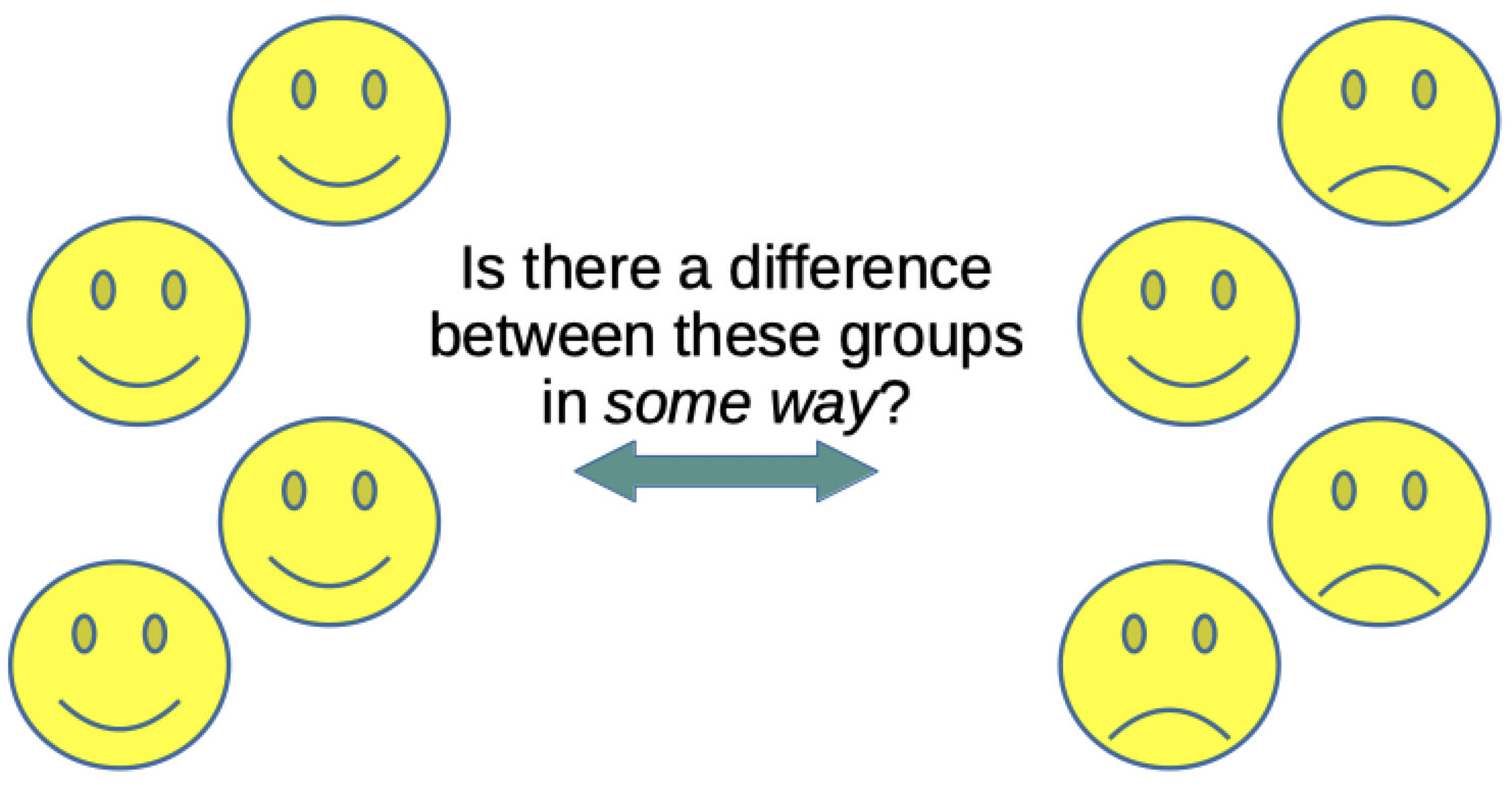
Part 1: Understanding Our Mystery Data 📊
The Detective’s First Clue: The Data
Imagine you work at a juice factory 🧃 and you have two filling machines. Your job is to figure out: “Are these machines filling bottles differently?”
We have measurements from 50 bottles filled by each machine. Let’s look at the numbers!
Why can’t we just compare averages?
Good question! While averages help, they don’t tell the whole story:
- Machine A average: 5.2 liters
- Machine B average: 5.3 liters
They look close! But what if Machine A is super consistent (all bottles around 5.2) while Machine B is all over the place (some 3, some 7)?
The average wouldn’t show us this important difference! We need to look at the distribution (spread) of the data too.
That’s where the t-test becomes our superpower! 🦸
Group 1 dataset
array([4.82311059, 5.64152115,
4.94118341, 4.51888519, 4.69452953,
4.99137589, 4.91842838, 6.37598021,
4.15584602, 6.55079577, 5.97303453,
6.95027014, 5.60942129, 4.92938286,
4.6932844, 5.26956469, 4.72835432,
4.71265135, 5.11285407, 6.93112916,
2.6664159 , 5.96984681, 5.61169188,
2.92437265, 6.25106099, 5.46805324,
5.38712146, 4.56640858, 5.18326553,
5.65786142, 4.69512564, 3.86439402,
7.37302804, 6.1169038 , 4.38961873,
6.27314289, 5.88551304, 5.34850487,
5.13206916, 7.61189171, 5.17720053,
5.88717038, 3.62097149, 3.02204612,
4.92681691, 4.31055542, 4.51201151,
4.2912872 , 4.63346511, 5.42599103])
Group 2 dataset
array([ 9.34838992,  7.59303945,
7.32399982, 6.19395197, 6.75827388,
8.22905613, 8.90642506, 7.19739203,
6.44502027, 8.73127784, 5.99917675,
8.79211838, 6.93085735, 7.53288447,
7.86203899, 7.97850888, 8.05638105,
8.52991009, 7.7587821,  9.17111222,
6.34387003, 8.32597246, 8.36348416,
8.32186526, 8.5008081 , 9.15884336,
9.3251948 , 7.52155757, 8.51486734,
6.02272479, 8.20096257, 6.58747512,
7.45891872, 8.22118695, 9.70966141,
8.18894409, 8.60399128, 7.0688741 ,
5.72850754, 7.30309111, 10.25824742,
8.48691697, 7.91207794, 8.72347449,
7.99540331, 8.51854714, 8.97678889,
7.7033359, 7.72142998, 9.0834914 ])
Visualizing the Mystery 👀
Look at these plots! Can you spot the difference?
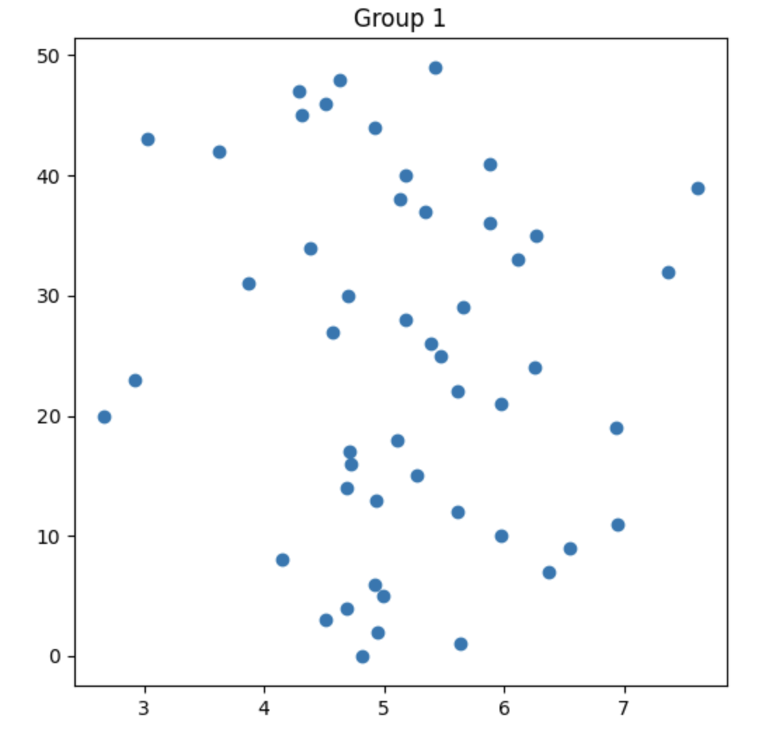
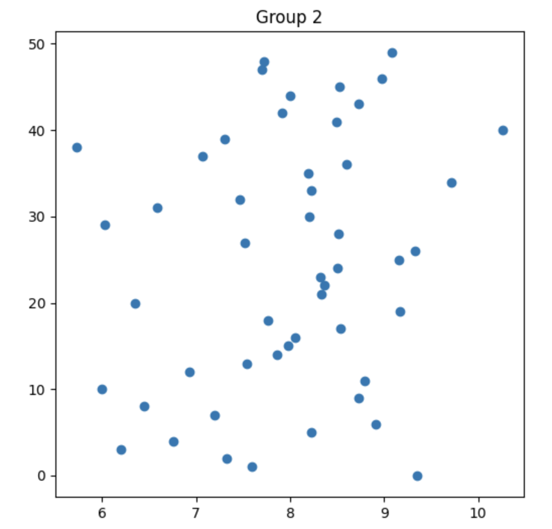
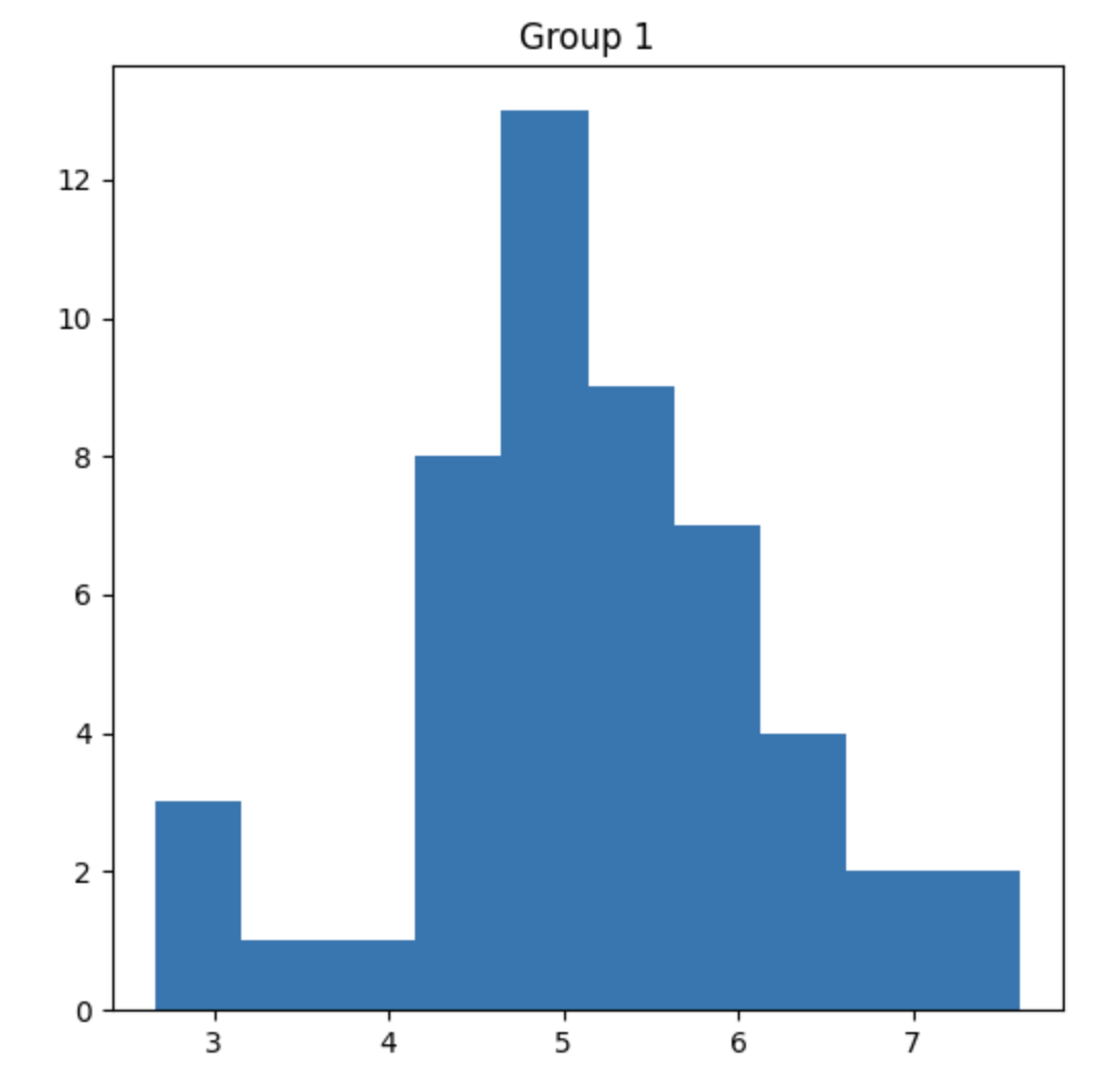
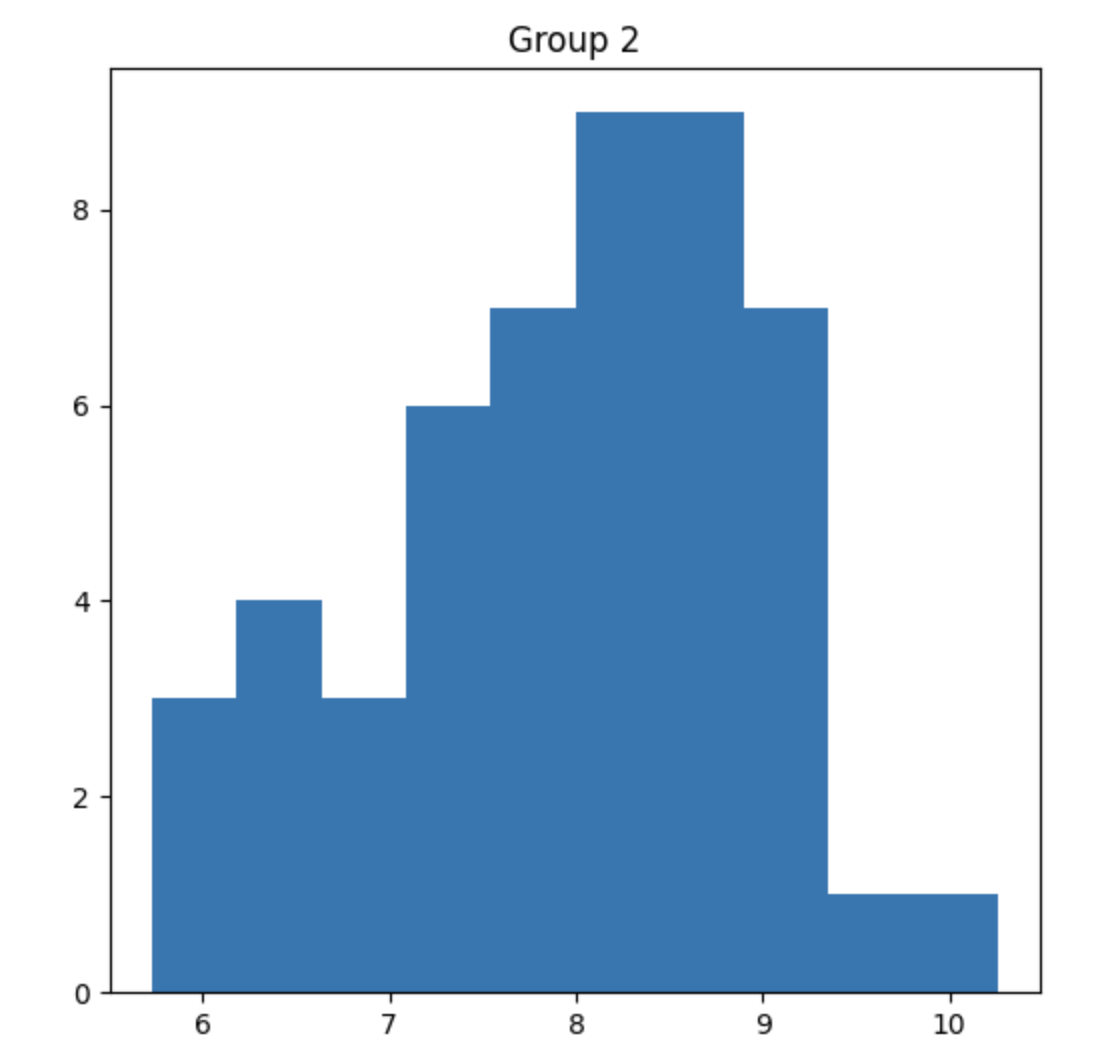
What you’re seeing:
- Scatter plots (top): Each dot is one measurement
- Histograms (bottom): Show how the data is distributed
Your detective mission: Do these look different enough that we can say the machines are REALLY different, or could this just be random chance?
Let’s find out! 🔍
Part 2: Setting Up Our Detective Questions 🤔
What Are Hypotheses?
In statistics, we always start with two competing ideas (like two suspects in a mystery):
🙅 Null Hypothesis (H₀) - “The Boring Explanation”
The claim: “Nothing special is happening. The two machines fill bottles the SAME way. Any difference we see is just random luck!”
Think of it like this: If you flip a coin 10 times and get 6 heads and 4 tails, that doesn’t prove the coin is unfair - that’s just random variation!
🎯 Alternative Hypothesis (Hₐ) - “Something’s Different!”
The claim: “The machines ARE filling bottles differently! There’s a REAL difference, not just luck!”
This is what we’re trying to prove. Like finding actual evidence of a crime, not just coincidence!
Our Specific Question:
“Do Machine 1 and Machine 2 fill bottles to significantly different levels?”
- H₀: The machines fill to the same average level (any difference = random)
- Hₐ: The machines fill to different average levels (real difference!)
Fun fact: We always START by assuming H₀ is true (“innocent until proven guilty”). Then we use math to see if we have enough evidence to reject it!
Part 3: The Magic P-Value! ✨
What’s a P-Value?
The p-value is like a “weirdness score” that tells us:
“If the machines were REALLY the same, what’s the probability we’d see a difference this big (or bigger) just by random chance?”
Understanding P-Values with an Analogy 🎲
Imagine:
- You have a normal die (1-6)
- You roll it and get: 6, 6, 6, 6, 6 (five sixes in a row!)
- Question: Is the die fair, or is it loaded?
The p-value would tell you: “If the die is fair, there’s only a 0.0129% chance (very tiny!) of getting five sixes in a row.”
Since that’s SO unlikely, you’d probably conclude: “This die is loaded!” (Reject H₀)
The P-Value Decision Rule 📏
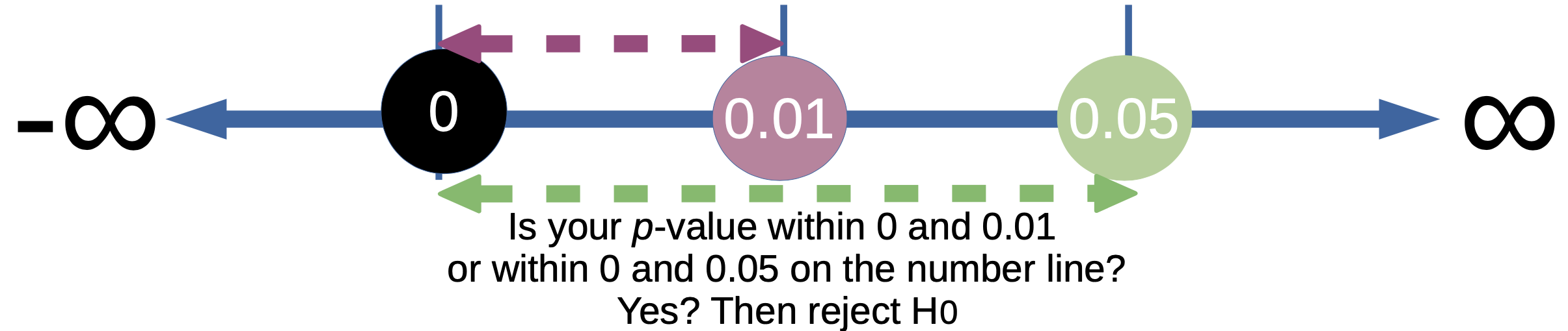
How to read the p-value:
| P-Value Range | What It Means | Decision |
|---|---|---|
| p < 0.01 | Less than 1% chance this is random! VERY STRONG evidence! 🔥 | Reject H₀ - The difference is REAL! |
| p < 0.05 | Less than 5% chance this is random. Good evidence! ✅ | Reject H₀ - Likely a real difference! |
| p ≥ 0.05 | More than 5% chance this is just random luck. 🤷 | Accept H₀ - Not enough evidence! |
Translation:
- Small p-value (< 0.05): “This is too weird to be random! Something’s different!”
- Large p-value (≥ 0.05): “This could easily happen by chance. Nothing to see here.”
Real-world standard: Most scientists use p < 0.05 as the cutoff (called “alpha” or α). If p < 0.05, we say the result is “statistically significant”!
Part 4: Let’s Code! Your First T-Test 💻
The Basic T-Test - Step by Step
What this code does: Generates two groups of random data and tests if they’re significantly different!
import numpy as np
from scipy.stats import ttest_ind

# Generate two sets of sample data
# Think of these as measurements from our two juice machines!

# Group 1: Machine A - average fill of 5 liters, standard deviation of 1
group1 = np.random.normal(5, 1, size=50)

# Group 2: Machine B - average fill of 7 liters, standard deviation of 1
group2 = np.random.normal(7, 1, size=50)

# Calculate the t-statistic and p-value using ttest_ind from SciPy
t_statistic, p_value = ttest_ind(group1, group2)

# Output the results
print("=" * 50)
print("T-TEST RESULTS")
print("=" * 50)
print(f"Group 1 mean: {np.mean(group1):.2f} liters")
print(f"Group 2 mean: {np.mean(group2):.2f} liters")
print(f"Difference: {np.mean(group2) - np.mean(group1):.2f} liters")
print(f"\nT-Statistic: {t_statistic:.4f}")
print(f"P-Value: {p_value:.10f}")
print("=" * 50)

# Make a decision!
if p_value < 0.01:
    print("🔥 VERY STRONG evidence! Reject H₀!")
    print("   The machines are DEFINITELY filling differently!")
elif p_value < 0.05:
    print("✅ Good evidence! Reject H₀!")
    print("   The machines are likely filling differently!")
else:
    print("🤷 Not enough evidence. Accept H₀.")
    print("   Can't prove the machines are different.")
Breaking Down the Math 🧮
What is np.random.normal(5, 1, size=50)?
- Creates 50 random numbers
- Mean (center) = 5: Most numbers cluster around 5
- Standard deviation = 1: Most numbers are within 1 unit of 5 (so between 4-6)
- This models real-world variation (no two bottles are EXACTLY the same!)
What is the T-Statistic?
- A number that measures how different the two groups are
- Formula (simplified):
t = (mean1 - mean2) / (combined variability) - Large t-value (far from 0): Groups are very different!
- Small t-value (close to 0): Groups are similar
What does ttest_ind do?
- Calculates the difference between group means
- Accounts for the spread (standard deviation) in each group
- Accounts for sample size
- Returns the t-statistic and p-value
Real Example Output:
==================================================
T-TEST RESULTS
==================================================
Group 1 mean: 5.02 liters
Group 2 mean: 7.01 liters
Difference: 1.99 liters
T-Statistic: -21.3456
P-Value: 0.0000000001
==================================================
🔥 VERY STRONG evidence! Reject H₀!
   The machines are DEFINITELY filling differently!
What this tells us: The p-value is TINY (way less than 0.05), so we’re very confident the machines are different!
Part 5: Visualizing the Difference 📊
Adding Histograms to See the Distribution
Why histograms? They show us the SHAPE of our data - we can see if it’s spread out or clustered!
import numpy as np
from scipy.stats import ttest_ind
import matplotlib.pyplot as plt

# Generate two sets of sample data
group1 = np.random.normal(5, 1, size=50)
group2 = np.random.normal(7, 1, size=50)

# Create side-by-side histogram comparison
fig, (ax1, ax2) = plt.subplots(1, 2, figsize=(14, 5))

# Plot Group 1
ax1.hist(group1, bins=15, color='skyblue', edgecolor='black', alpha=0.7)
ax1.axvline(np.mean(group1), color='red', linestyle='--', linewidth=2,
            label=f'Mean = {np.mean(group1):.2f}')
ax1.set_title('Group 1 Distribution', fontsize=14, fontweight='bold')
ax1.set_xlabel('Measurement (liters)')
ax1.set_ylabel('Frequency (count)')
ax1.legend()
ax1.grid(alpha=0.3)

# Plot Group 2
ax2.hist(group2, bins=15, color='lightcoral', edgecolor='black', alpha=0.7)
ax2.axvline(np.mean(group2), color='red', linestyle='--', linewidth=2,
            label=f'Mean = {np.mean(group2):.2f}')
ax2.set_title('Group 2 Distribution', fontsize=14, fontweight='bold')
ax2.set_xlabel('Measurement (liters)')
ax2.set_ylabel('Frequency (count)')
ax2.legend()
ax2.grid(alpha=0.3)

plt.tight_layout()
plt.show()

# Run the t-test
t_statistic, p_value = ttest_ind(group1, group2)

# Output the results
print("\n" + "=" * 50)
print("T-TEST RESULTS WITH VISUALIZATION")
print("=" * 50)
print(f"Group 1 mean: {np.mean(group1):.2f} liters")
print(f"Group 2 mean: {np.mean(group2):.2f} liters")
print(f"T-Statistic: {t_statistic:.4f}")
print(f"P-Value: {p_value:.10f}")

if p_value < 0.05:
    print("\n✅ SIGNIFICANT! The groups are different!")
else:
    print("\n🤷 NOT SIGNIFICANT. Can't prove they're different.")
What you’ll see:
- Two histograms side by side
- Red dashed lines showing the average (mean) of each group
- Group 1 centers around 5, Group 2 centers around 7
- Clear visual separation = strong evidence they’re different!
Reading histograms:
- Tall bars: Many measurements at that value
- Short bars: Few measurements at that value
- Bell shape: Normal distribution (most data near the middle)
Part 6: The Complete Visualization 🎨
Combining Scatter Plots + Histograms
Now let’s see EVERYTHING at once! This gives us the complete picture of our data.
import numpy as np
from scipy.stats import ttest_ind
import matplotlib.pyplot as plt

# Generate two sets of sample data
# Try DIFFERENT means to see significant results!
group1 = np.random.normal(5, 1, size=50)
group2 = np.random.normal(8, 1, size=50)

# Create a 2x2 grid of plots
fig, ((ax1, ax2), (ax3, ax4)) = plt.subplots(2, 2, figsize=(14, 10))
fig.suptitle('Complete T-Test Visualization', fontsize=16, fontweight='bold')

# Top-left: Group 1 Scatter Plot
y_values = list(range(len(group1)))
ax1.scatter(group1, y_values, alpha=0.6, s=100, color='skyblue', edgecolors='black')
ax1.axvline(np.mean(group1), color='red', linestyle='--', linewidth=2,
            label=f'Mean = {np.mean(group1):.2f}')
ax1.set_title('Group 1 Scatter', fontweight='bold')
ax1.set_xlabel('Measurement (liters)')
ax1.set_ylabel('Sample Number')
ax1.legend()
ax1.grid(alpha=0.3)

# Top-right: Group 2 Scatter Plot
ax2.scatter(group2, y_values, alpha=0.6, s=100, color='lightcoral', edgecolors='black')
ax2.axvline(np.mean(group2), color='red', linestyle='--', linewidth=2,
            label=f'Mean = {np.mean(group2):.2f}')
ax2.set_title('Group 2 Scatter', fontweight='bold')
ax2.set_xlabel('Measurement (liters)')
ax2.set_ylabel('Sample Number')
ax2.legend()
ax2.grid(alpha=0.3)

# Bottom-left: Group 1 Histogram
ax3.hist(group1, bins=15, color='skyblue', edgecolor='black', alpha=0.7)
ax3.axvline(np.mean(group1), color='red', linestyle='--', linewidth=2)
ax3.set_title('Group 1 Distribution', fontweight='bold')
ax3.set_xlabel('Measurement (liters)')
ax3.set_ylabel('Frequency')
ax3.grid(alpha=0.3)

# Bottom-right: Group 2 Histogram
ax4.hist(group2, bins=15, color='lightcoral', edgecolor='black', alpha=0.7)
ax4.axvline(np.mean(group2), color='red', linestyle='--', linewidth=2)
ax4.set_title('Group 2 Distribution', fontweight='bold')
ax4.set_xlabel('Measurement (liters)')
ax4.set_ylabel('Frequency')
ax4.grid(alpha=0.3)

plt.tight_layout()
plt.show()

# Perform the t-test
t_statistic, p_value = ttest_ind(group1, group2)

# Detailed results
print("\n" + "=" * 60)
print(" " * 15 + "COMPREHENSIVE T-TEST REPORT")
print("=" * 60)
print(f"\n📊 DESCRIPTIVE STATISTICS:")
print(f"   Group 1: Mean = {np.mean(group1):.3f}, Std Dev = {np.std(group1):.3f}")
print(f"   Group 2: Mean = {np.mean(group2):.3f}, Std Dev = {np.std(group2):.3f}")
print(f"   Difference in means: {abs(np.mean(group2) - np.mean(group1)):.3f}")
print(f"\n🔬 TEST STATISTICS:")
print(f"   T-Statistic: {t_statistic:.4f}")
print(f"   P-Value: {p_value:.10f}")
print(f"   Sample size: {len(group1)} per group")
print(f"\n🎯 INTERPRETATION:")
if p_value < 0.001:
    print("   *** EXTREMELY SIGNIFICANT *** (p < 0.001)")
    print("   🔥🔥🔥 Almost impossible this is random chance!")
    print("   Decision: STRONGLY reject H₀")
elif p_value < 0.01:
    print("   ** VERY SIGNIFICANT ** (p < 0.01)")
    print("   🔥🔥 Very strong evidence of a real difference!")
    print("   Decision: Reject H₀")
elif p_value < 0.05:
    print("   * SIGNIFICANT * (p < 0.05)")
    print("   ✅ Good evidence of a real difference!")
    print("   Decision: Reject H₀")
else:
    print("   NOT SIGNIFICANT (p ≥ 0.05)")
    print("   🤷 Could easily be random chance")
    print("   Decision: Accept H₀ (can't prove difference)")
print("=" * 60)
What the plots show you:
- Scatter plots (top): Individual data points - see the spread!
- Histograms (bottom): Overall distribution shape
- Red dashed lines: Group averages (means)
- Separation: If the red lines are far apart AND the groups don’t overlap much → significant!
Try this experiment:
- Run with
group1 = np.random.normal(5, 1, size=50)andgroup2 = np.random.normal(8, 1, size=50)→ Should be significant! - Run with
group1 = np.random.normal(5, 1, size=50)andgroup2 = np.random.normal(5, 1, size=50)→ Should NOT be significant! - Run with
group1 = np.random.normal(5, 1, size=50)andgroup2 = np.random.normal(5.5, 1, size=50)→ Borderline! What do you get?
Part 7: Fun Experiments to Try! 🧪
Experiment 1: Testing Sample Size
Question: Do we need more data to detect a small difference?
import numpy as np
from scipy.stats import ttest_ind

print("EXPERIMENT: How does sample size affect our results?")
print("=" * 60)

# Small difference between groups (5.0 vs 5.3)
mean1, mean2 = 5.0, 5.3

for sample_size in [10, 30, 50, 100, 500]:
    group1 = np.random.normal(mean1, 1, size=sample_size)
    group2 = np.random.normal(mean2, 1, size=sample_size)

    t_stat, p_val = ttest_ind(group1, group2)

    significant = "✅ SIGNIFICANT!" if p_val < 0.05 else "❌ Not significant"
    print(f"Sample size: {sample_size:3d} → p-value: {p_val:.4f} {significant}")

print("\n💡 What you learned:")
print("   Larger samples make it easier to detect small differences!")
Experiment 2: Effect of Variability
Question: What if one group is super consistent and the other is all over the place?
import numpy as np
from scipy.stats import ttest_ind

print("\nEXPERIMENT: How does variability (spread) affect results?")
print("=" * 60)

# Both groups have same mean (5.0), but different spreads
mean = 5.0

for std_dev in [0.5, 1.0, 2.0, 5.0]:
    group1 = np.random.normal(mean, 0.5, size=50)  # Consistent
    group2 = np.random.normal(mean, std_dev, size=50)  # Varying spread

    t_stat, p_val = ttest_ind(group1, group2)

    significant = "✅ SIGNIFICANT!" if p_val < 0.05 else "❌ Not significant"
    print(f"Group 2 std dev: {std_dev:.1f} → p-value: {p_val:.4f} {significant}")

print("\n💡 What you learned:")
print("   When both groups have the same mean, high variability")
print("   doesn't create a significant difference in means!")
Experiment 3: The Tricky Case - Same Mean, Different Spread
import numpy as np
from scipy.stats import ttest_ind, levene
import matplotlib.pyplot as plt

# Both groups centered at 5, but VERY different spreads
group1 = np.random.normal(5, 0.5, size=100)  # Tight cluster
group2 = np.random.normal(5, 3.0, size=100)  # Wide spread

# Visualize
fig, (ax1, ax2) = plt.subplots(1, 2, figsize=(14, 5))

ax1.hist(group1, bins=20, alpha=0.7, label='Group 1 (low variability)', color='skyblue')
ax1.hist(group2, bins=20, alpha=0.7, label='Group 2 (high variability)', color='lightcoral')
ax1.axvline(np.mean(group1), color='blue', linestyle='--', linewidth=2)
ax1.axvline(np.mean(group2), color='red', linestyle='--', linewidth=2)
ax1.set_title('Overlapping Distributions', fontweight='bold')
ax1.set_xlabel('Measurement')
ax1.legend()
ax1.grid(alpha=0.3)

ax2.boxplot([group1, group2], labels=['Group 1', 'Group 2'])
ax2.set_title('Box Plot Comparison', fontweight='bold')
ax2.set_ylabel('Measurement')
ax2.grid(alpha=0.3)

plt.tight_layout()
plt.show()

# Test for difference in means
t_stat, p_val_means = ttest_ind(group1, group2)

# Test for difference in variance (spread)
levene_stat, p_val_variance = levene(group1, group2)

print("=" * 60)
print("TRICKY CASE: Same mean, different spread")
print("=" * 60)
print(f"Group 1 mean: {np.mean(group1):.2f}, std: {np.std(group1):.2f}")
print(f"Group 2 mean: {np.mean(group2):.2f}, std: {np.std(group2):.2f}")
print(f"\nT-test (tests means): p = {p_val_means:.4f}")
print(f"Levene test (tests variance): p = {p_val_variance:.4f}")
print("\n💡 Lesson: T-tests compare MEANS, not spread!")
print("   Use Levene's test or F-test to compare variability!")
Part 8: Real-World Applications 🌍
Example 1: A/B Testing for Websites
import numpy as np
from scipy.stats import ttest_ind

# Website A vs Website B: Which keeps users longer?
# Time spent on site (in minutes)

website_a_times = np.random.normal(4.5, 1.2, size=200)  # Average 4.5 min
website_b_times = np.random.normal(5.2, 1.3, size=200)  # Average 5.2 min

t_stat, p_val = ttest_ind(website_a_times, website_b_times)

print("🌐 A/B TEST: Website Design Comparison")
print("=" * 50)
print(f"Website A average: {np.mean(website_a_times):.2f} minutes")
print(f"Website B average: {np.mean(website_b_times):.2f} minutes")
print(f"P-value: {p_val:.6f}")

if p_val < 0.05:
    winner = "B" if np.mean(website_b_times) > np.mean(website_a_times) else "A"
    print(f"\n✅ Website {winner} is significantly better!")
    print("   → Launch the new design!")
else:
    print("\n🤷 No significant difference")
    print("   → Stick with current design or test more users")
Example 2: Student Test Scores
# Did the new teaching method work?
control_group = np.random.normal(75, 10, size=30)  # Traditional method
treatment_group = np.random.normal(82, 10, size=30)  # New method

t_stat, p_val = ttest_ind(control_group, treatment_group)

print("\n📚 EDUCATION STUDY: Teaching Method Comparison")
print("=" * 50)
print(f"Control (old method): {np.mean(control_group):.1f}%")
print(f"Treatment (new method): {np.mean(treatment_group):.1f}%")
print(f"Improvement: {np.mean(treatment_group) - np.mean(control_group):.1f} points")
print(f"P-value: {p_val:.6f}")

if p_val < 0.05:
    print("\n✅ New teaching method is significantly better!")
else:
    print("\n🤷 Can't prove new method is better")
Conclusion: You’re Now a Statistical Detective! 🎓
What You’ve Learned:
✅ Hypothesis Testing: Setting up null vs alternative hypotheses
✅ P-Values: Understanding and interpreting statistical significance
✅ T-Tests: Running and reading t-test results
✅ Visualization: Using histograms and scatter plots to understand data
✅ Sample Size: Why bigger samples give more reliable results
✅ Real Applications: A/B testing, education research, and more!
Key Takeaways:
- Small p-value (< 0.05) = Real difference (reject H₀)
- Large p-value (≥ 0.05) = Can’t prove difference (accept H₀)
- Larger samples = Better at detecting small differences
- T-tests compare means, not variability
- Always visualize your data before testing!
Challenge Yourself! 🏆
Challenge 1: Create data from three different groups and test each pair. Do they all differ?
Challenge 2: Simulate rolling two dice 100 times each. Does one die seem “loaded”?
Challenge 3: Generate medical data: placebo vs drug. Make the drug slightly better. How many patients do you need to detect the difference?
Keep Learning! 📚
Want to dive deeper? Check out these resources:
Remember: Statistics helps us make better decisions based on data. You’re now equipped to be a data detective! Keep practicing and exploring! 🚀